Building a retail bank that millions trust
BTG Pactual · 2020–2022 · Associate Design Director
Zero-to-one in one of the most competitive fintech markets in the world.
No product, no design team, no process — competing against Nubank, Inter, Itaú, and Santander from day one.
The business context
My contribution

How we worked


Three strategic bets
Craft and experience framing
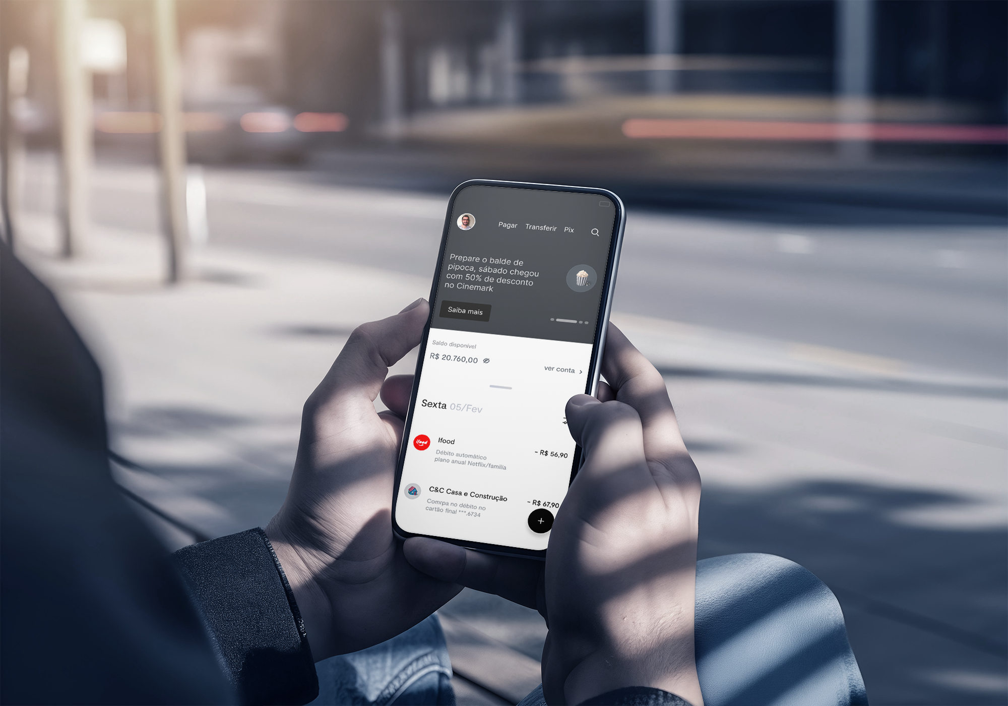
The visual adjustments implemented post-test, after the handover by the consulting firm, corrected flaws and major usability issues that negatively impacted the experience. These included the absence of a z-axis for implementing the surface, uncommon elements for users’ repertoire, and negligence regarding JTBD (Just-to-Be-Done).

My work was to show that it was possible to combine well-executed aesthetics with adjustments that the user understands and that ultimately affect the business process.
The product perspective from inside the machine is incomparable to the superficial layer that a consulting firm is able to see. After testing, visual refinement.

As part of our global strategy, we are dedicated to introducing financial products in a completely innovative and unique manner. In Brazil, as in many parts of the world, we operate within a highly competitive environment where the value proposition extends beyond the product itself. Customer choices are driven by exceptional experiences.

The concept of flat and minimalist design has evolved due to user preferences. The introduction of the Z-axis has been employed to enhance the usability of floating menu buttons. Although this deviates from the original design intent, it has become a necessary adaptation to meet user needs effectively.

Results · BTG Banking · 2020 → 2024
A delightful experience
What drove this shift
Product vision
Product vision is not declared — it is earned over time. Built by nearly 300 professionals, shaped by real usage, not assumptions.